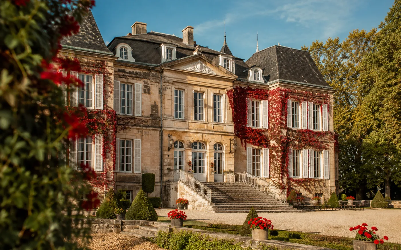
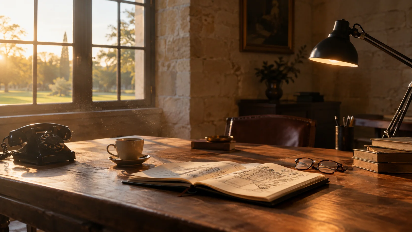
The first three seconds: is it beautiful.
The first photograph decides everything that follows. Not the most complete one, not the one showing the most buildings: the one you want to be in. A façade at midday, flat and shadowless, loses against a table laid at the end of the day, even if the façade is the more impressive of the two.
It is also the moment where slow sites are lost. An eight megabyte image will take four seconds to appear on a phone on 4G, and the tab will be closed before then. It is the first thing I check on a site I am asked to rebuild.
The next thirty seconds: is it right for us.
The couple is looking for four pieces of information, and they look for them in this order.
- How many people at table. A minimum and a maximum. Without that figure, half your visitors do not know whether your venue is for them.
- Where exactly it is. The region, the nearest town, the distance from the nearest city. Their guests are travelling.
- Whether one can sleep on site. How many rooms, and if none, what accommodation is nearby.
- What is included. Caterer imposed or free, furniture, tableware, cleaning, what time the music must stop. It is that list, rather than a published price, which tells a couple whether they are wasting their time.
Each of those missing is a reason to leave. They do not each need a page of their own, they need to be findable without searching.
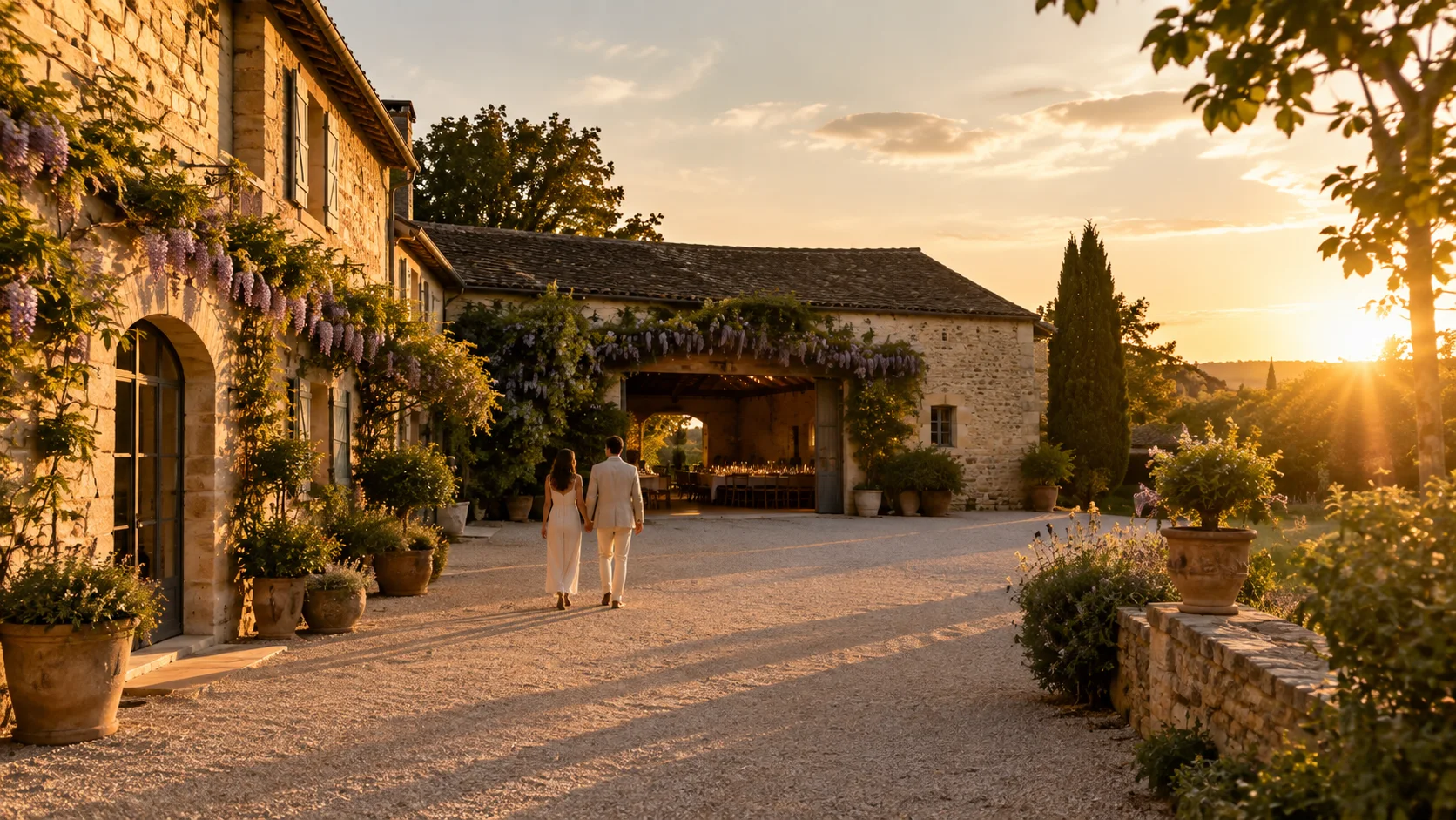
The two minutes after that: can I picture myself here.
This is where the gallery does its work, provided it shows receptions and not only walls. An empty park says nothing. The same park with tables, guests and evening light tells the story of the evening the couple is already imagining.
It is also where reviews count, the ones on your Google listing as much as those on the platforms. Not their score, but what they say about you: about the welcome, the flexibility, and what happened on the day it rained.
The moment of the enquiry.
A couple who has decided to write should not have to work out how. The enquiry button must be visible on every page, not only in the footer, and the form must stay short. Three or four fields, plus the date they have in mind and the number of guests, which let you answer usefully the first time.
An enquiry is not an application. Every field you make compulsory costs you enquiries, and it is rarely the weakest ones that give up: it is the ones in the biggest hurry.
The questions I am asked next
How many photographs should you show?
Enough to see it all, not enough to tire. Twenty well chosen ones are worth more than a hundred views of the same park. The useful rule is about their content rather than their number: show receptions and not only walls, and give every space you let its own series of images. A room photographed once cannot be visited.
A form, or simply an email address?
A form, because it saves you the return trip. Asking for the date in mind and the number of guests up front lets you answer usefully the first time, instead of writing back with two questions. Keep the address visible beside it, for those who prefer to write themselves.
Should reviews appear on the site when they are already on Google?
Yes, because nobody opens a second tab to go and find them. Three or four reviews reproduced on the site, with a first name and a month, do the job. What matters is not the rating but what they say about the welcome and the flexibility, and above all about the day it rained.
Is an English version necessary?
As soon as the venue can attract couples from abroad, which is the case for most estates with character. You settle the question by looking at where your current enquiries come from, and at your neighbours in the region. When the answer is yes, it needs to be a genuine English site, not an automatic translation button: search engines do not index a translation performed in the browser.
These four pieces of information are what I check on every site I take over. It is rare to find all four, and common to find none of them visible without scrolling through three pages.